
Correction: Causal Diagramming Requires Drawing
My last post, on test iterativity and multiple causal mechanisms in medicine, skipped the crucial first step

My last post concluded “the apparent irrelevance of equilibria and information effects to the medical case studies here (if correct) suggests that such improvements may be easiest in medicine and more important in security.”
This was wrong. I was fleshing out some intuitions for the medical issue area of my Fienberg critique — extending the implications of causal diagramming, without actually drawing the relevant causal diagrams. Oops.

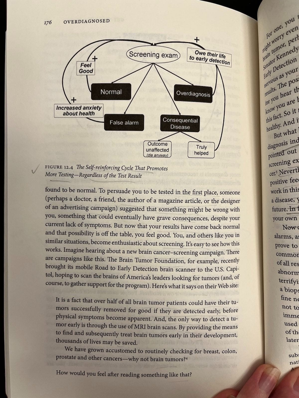
I realized the error while subsequently revisiting Figures 12.3 and 12.4 from Overdiagnosed (Welch, Schwartz, and Woloshin, 2011), which illustrate self-reinforcing cycles in both provider and patient behavior around screening.
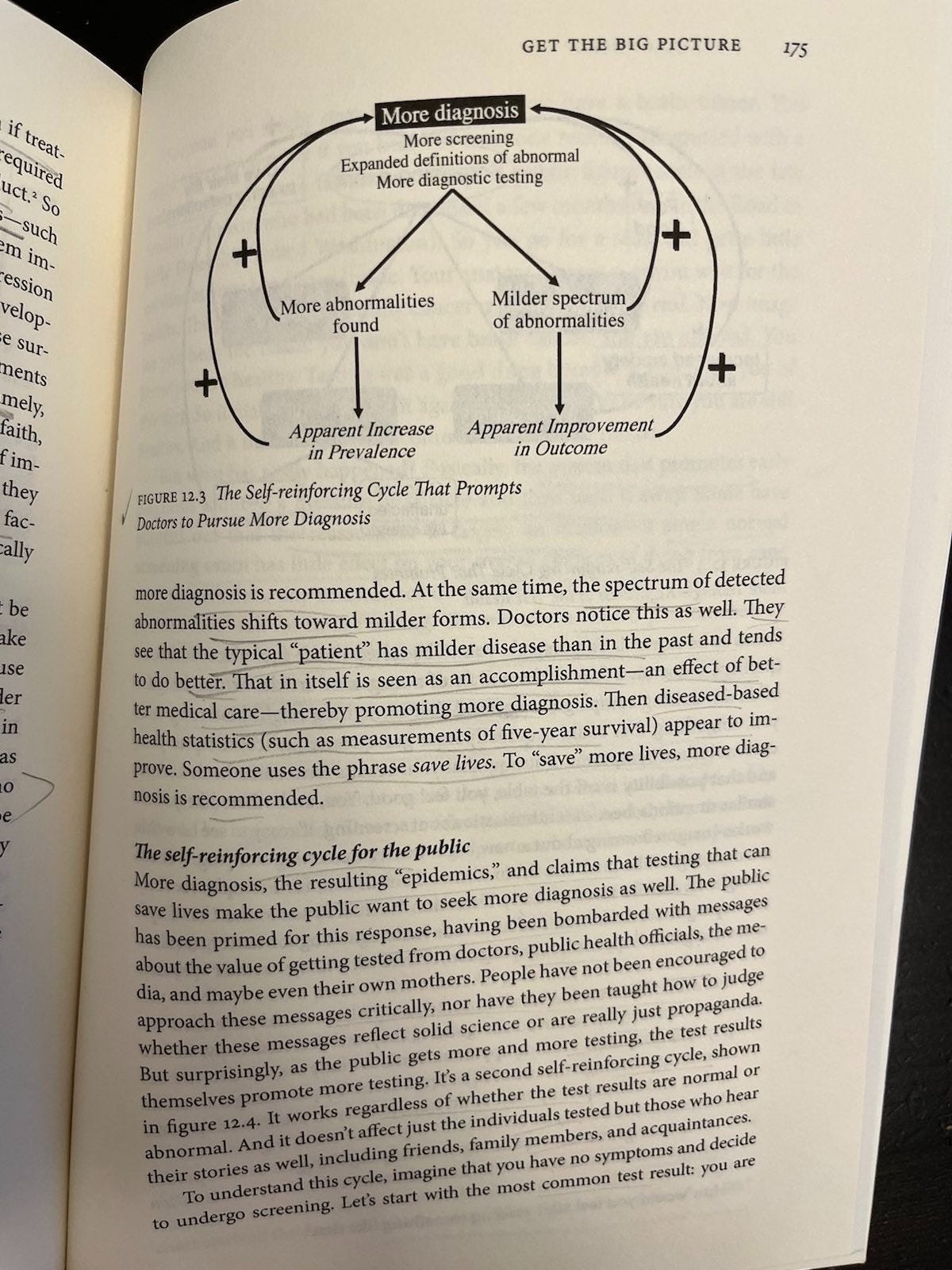
For the doctors’ cycle (more diagnosis), Welch’s Figure 12.3 addresses the self-reinforcing provider loop at the clinical level. Here, more diagnosis → more abnormalities → milder cases → apparent improvement in outcomes → incentive for more diagnosis. No perverse incentives required. Clinicians just trying to do their jobs get fooled by what looks like good preventive medicine, but is overdiagnosis.
Where does this fit into the foundational mass screenings for low prevalence problems (test —> classification, strategic behavior, and information effects (three different causal mechanisms) —> outcome) causal diagrams?
Classification produces more diagnosis. Apparent improvement as an artifact of more diagnosis (e.g., more cancer cases and/or cases diagnosed earlier, but no provable increase in length of life and possible net decrease in quality of life) is an informational effect, not a real health outcome. This implicates moderating (interaction) effects, something DAGs don’t show. (But I am lawless and have drawn them in the graph for now, anyway.)
That informational distortion, in turn, feeds back into both provider and patient beliefs, which in turn affect strategic behavior and selection into testing. It’s getting messy. This is supposed to be a simplifying heuristic, remember?
However, this is still only part of the story. The other part is about perverse incentives, which Welch et al address in the context of medical practice. As I wrote previously:
Welch et al take great pains to frame their criticisms of perverse incentives in relation to the point that there can also be elements of “true belief” among doctors, patients, and everyone else. But that I don’t see that belief as being necessarily separate from the way in which financial incentives are stacked. Rather, money is power, and power can influence both belief and behavior. “It’s hard to get a man to understand something his job depends on him not understanding,” as the saying goes.
Anyway, the structure of their story there looks something like this:
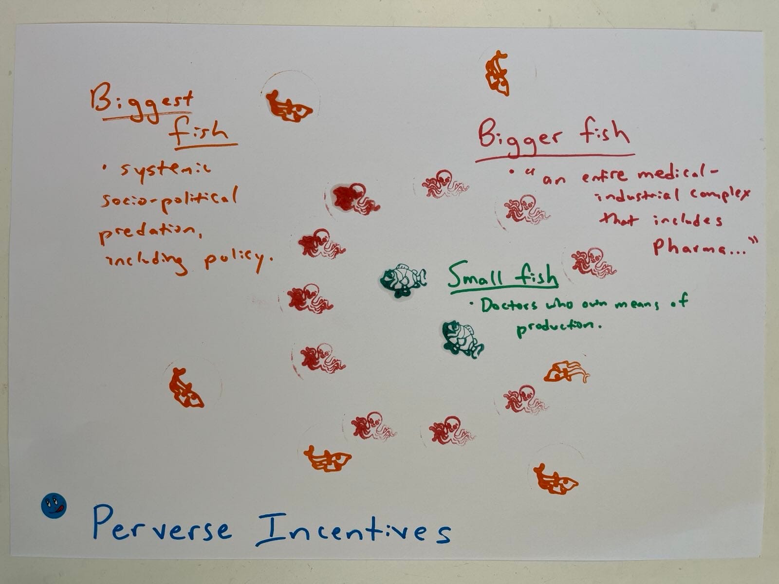
… Featuring providers (e.g., who make money on testing because they own the imagine equipment) at the level I call “small fish,” “an entire medical-industrial complex that includes Pharma” encircling them as “bigger fish” (pictured here as octopi), and a larger level of systematic socio-political predation, including policy as the “biggest fish” (picture here as circling sharks).
My hunch is that, since my previous take on mass surveillance was too dark, this could probably also be reframed to make it (at least) more about stupidity and less about evil. But you get the point.
This suggests the causal diagram needs something under strategic behavior about why and how providers choose to test more, or pitch testing options to patients differently. For example, financial incentives, fear of legal liability (even if it’s empirically wrong, juries might be inclined to believe dying patients and their families, not doctors who knew their statistics), social norms, and reputational concerns (if everyone else is doing something, providers might feel pressured to do it, too). This, in turn, would cause more selection into the test. Information effects of more diagnosis (provider and patient beliefs) could magnify these strategic behavioral factors (a moderating effect).
Drawing the identified cycles into causal graphs building on my ideal-type test DAG/DCG set shows that we do have to worry about strategic behavior and information effects in medical screenings, just as we have to worry about them in security and other domains. This demonstrates the power of causal diagramming to advance logical thinking by boosting the feeble brainpower of silly monkeys like me. And that looks something like this:
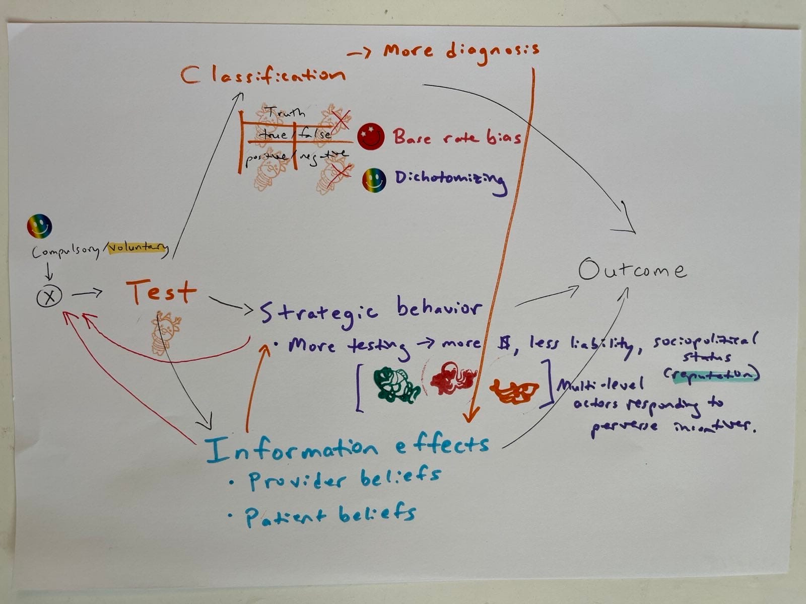
Not exactly a bolt out of the blue though, is it? Yeah, I know. OF COURSE we have to worry about those two additional causal mechanisms in doing the missing causal diagramming for medical test case studies like those addressed in my favorite Harding Center Fact Boxes. That was the whole point of the diagrams, in the first place.
On the left-hand side of the diagram, the compulsory/voluntary variable value still appears set only partly at voluntary instead of specifying it on a binary value. This is because some medical screenings are effectively compulsory (e.g., screening all pregnant women for HIV, hepatitis, even gestational diabetes in many country contexts).
This sort of diagram could be extended to medical interventions, some of which are also compulsory or effectively compulsory (like many vaccines).
It also suggests a logical next post: the draft tentatively entitled “These Are A Few of My Favorite Things (That DAGs don't do: equilibrium effects, bias in real life where feedback exists, private information constraints, perverse incentives that impact selection, and moderating effects).” However, this is a post I don’t have the time, knowledge, or spiritual fortitude to write today.
I didn’t manage to put Welch’s Figure 12.4 (patient beliefs cycle) in yet. There are several things I’m not sure about. E.g., would preventive health behavior go there? Does it go anywhere? Do testing regimes exert causal effects on strategic patient behavior like that?
In addition to remaining incomplete, this is probably still wrong in parts. But better wrong and sketched, than right and unwritten.