
Three Updates for Fact Boxes
Another way to improve on Harding Center-style Fact Boxes in risk communication

I’m still wondering how to improve on the Harding Center’s gold-standard risk communication Fact Boxes, starting with (1) acknowledging iterativity, (2) basing them on causal modeling, and (3) considering case-by-case differences in qualitative use and how it changes payoffs (e.g., prostate-specific antigen testing as informative, so it doesn’t necessarily invoke secondary screening harms; non-invasive prenatal testing as usually causing elective abortion when it identifies trisomies, so we have to follow the causal logic out to see the results of that). Yes, I’m trying to break all my favorite toys at once. So I can then convince people that rebuilding them sounds like fun.
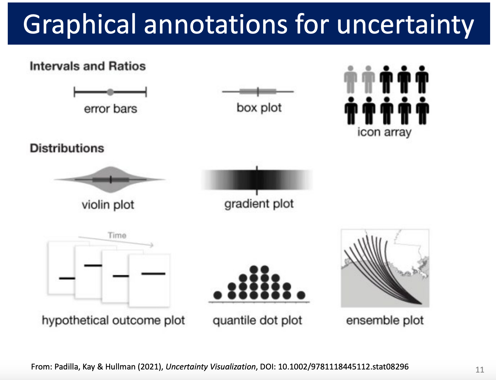
One thing to add to this list: (4) acknowledging uncertainty in existing estimates of costs and benefits. This could be done in an icon array among other graphical possibilities (image is slide 11 of York University Psychology Professor and Statistical Consulting Service director Michael Friendly’s “Visualizing Uncertainty” lecture, citing Padilla, Kay & Hullman (2021), Uncertainty Visualization):
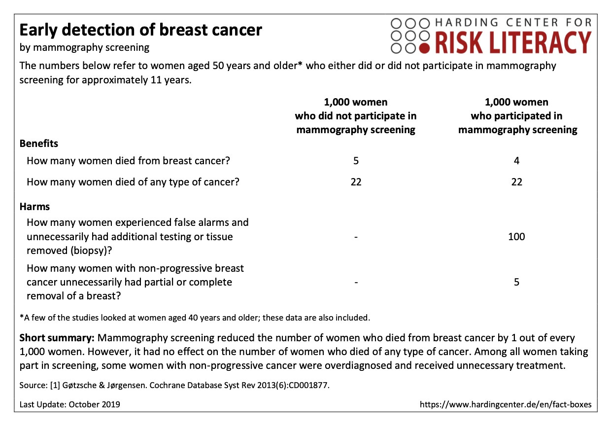
If you are a true-blue Harding Center fan like me, you may recognize the icon array as already being part of their signature workup. For mammography, for instance, they have a 2019-vintage icon array presentation of the 2013 Gøtzsche & Jørgensen findings:

There are three needed updates here:
The best current source is probably Bretthauer et al, JAMA, 2024, which again found in a meta-analysis of randomized clinical trials that mammography may have decreased women’s lifespan by up to 190 days or increased it by up to 237 days (95% CI). .
That uncertainty needs to be represented in the frequency-format table (below) as well as the icon array (above).

From my perspective, however, complicating the picture with uncertainty might make the already-busy icon array version harder to understand. I like the numbers better already; but I’m used to these tables, and you like what you’re used to. There’s some evidence that using icon arrays in tabular layouts with ranges to communicate uncertainty may advance patient understanding of risk (“Investigating the presentation of uncertainty in an icon array: A randomized trial,” Recchia et al, PEC InnovationVol. 1, Dec. 2022).
Somehow, people need to understand that there are actually four distinct causal mechanisms at work in programs of this structure, not only one: Mass screenings or preventive interventions for low-prevalence problems, like mammography for early breast cancer detection or mass surveillance for child abuse, work as tests that invoke the accuracy-error trade-off — which may doom them to backfire on this level of causal logic under common conditions of rarity, persistent classification uncertainty, and secondary screening harms. But they also exert causal effects on the level of strategic behavior, information, and resource (re)allocation.
For mammography and other medical tests, and probably all programs of this structure across other domains as well, this raises concerns about perverse incentives. In the medical and scientific realm in particular, it resonates with familiar criticisms that institutions tend to fund safe research and not exciting new leads that could entail greater risk but greater reward (e.g., ibuprofen for postpartum breast cancer prevention).
It’s obvious how to search the medical literature (PubMed) and fully interpret the latest reported compatibility intervals. It’s non-obvious, however, how to estimate, illustrate, and combine uncertainty from all four causal mechanisms in a new risk literacy model based on more solid contemporary methodological ground. One way probably involves using Bayesian methods to simulate uncertainty along all four paths given the available data. This seems more plausibly plausible in this case study than in others, given that we have good ultimate outcome measure data in this context (i.e., breast cancer deaths, all-cancer deaths, and all-cause deaths under different screening conditions in different countries). Data that are often more challenging to get in other contexts.
(It didn’t seem to me that the iterativity and qualitative use differences critiques applied in practically meaningful ways to the mammography case. The cumulative risk of cancer from the radiation, for instance, is estimated to be quite small. So the improvements list is different for different cases, and longer for some like prostate-specific antigen testing and non-invasive prenatal testing that I’ve written about recently here.)